Matplot을 이용한 시각화
파이썬으로 데이터를 시각화 하는데에는 Matplotlib 라이브러리를 가장 많이 사용한다.
Matplotlib 은 파이썬에서 2D 형태의 그래프, 이미지 등을 그릴때 사용하는 것으로
실제 과학 컴퓨팅 분야나 인공지능 분야에서도 많이 사용 됨.
Matplotlib 모듈에는 다양한 모듈들이 많이 있는데 그 중에서 가장 기본이 되는 pyplot이 서브모듈이다.
직선 그래프
import matplotlib.pyplot as plt
# 1. plot() : 직선 혹은 꺽은선의 그래프를 그릴 때 사용
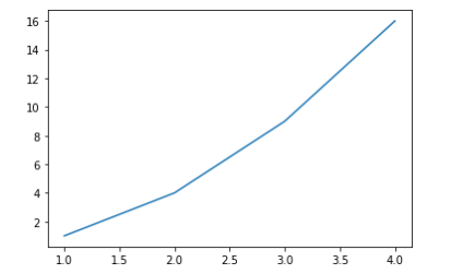
# 꺽은선 그래프
plt.plot([1,2,3,4],[1,4,9,16]) # x, y축
plt.show()
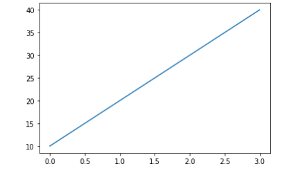
# 직선그래프
plt.plot([10,20,30,40])
plt.show()
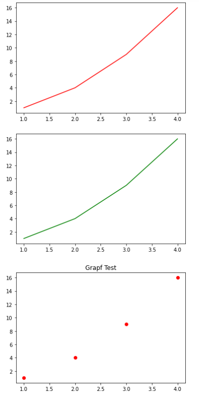
# 그래프에 기본적인 옵션 추가하기

plt.plot([1,2,3,4],[1,4,9,16],'r') # red
plt.show()

plt.plot([1,2,3,4],[1,4,9,16],'g') # green
plt.show()

plt.plot([1,2,3,4],[1,4,9,16],'ro') # 점선
# plt.axis([0.6,0.20])
plt.title("Grapf Test") # 타이틀적용
plt.show()
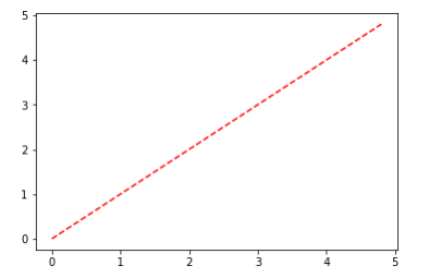
겹쳐진 그래프
import numpy as np
np.random.seed(100)
# 0부터 5 미만까지 ... 0.2 간격으로

t = np.arange(0,5,0.2)
t

plt.plot(t,t,'r--')
plt.show() # 점선
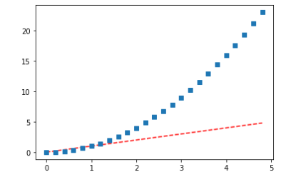
plt.plot(t,t,'r--', t, t**2,'s') # squre type
plt.show()
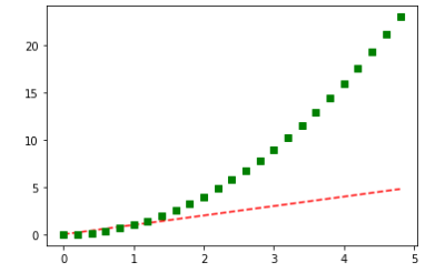
plt.plot(t,t,'r--', t, t**2,'gs') # 색상변경, g- green
plt.show()
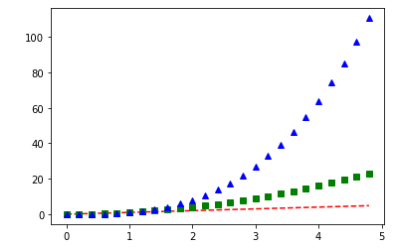
plt.plot(t,t,'r--', t, t**2,'gs',t, t**3,'b^') # 색상변경, b - blue, ^-tryangle
plt.show()
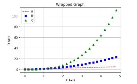
겹쳐진 그래프에 옵션 지정하기
plt.plot(t,t,'r--', label = 'A')
plt.plot(t,t**2,'bs', label = 'B')
plt.plot(t,t**3,'g^', label = 'C')

plt.legend() # 이 부분을 해줘야 label이 표시된다
plt.title("Wrapped Graph")
plt.xlabel('X Axis')
plt.ylabel('Y Axis')
plt.grid()
plt.show()
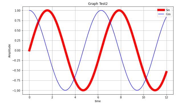
파형을 나타내는 그래프
t=np.arange(0,12,0.01)

# 기본으로 존재하는 figure가 아닌 새로운 figure를 생성하기 위해 다시 영역을 설정한다.
plt.figure(figsize=(10,6))

plt.plot(t, np.sin(t),'r', lw=8, label='Sin') # lw - line width
plt.plot(t, np.cos(t),'b', label = 'Cos')

plt.legend()
plt.grid()

plt.title("Graph Test2")
plt.xlabel('time')
plt.ylabel('Amplitude')


plt.show()
예제 활용
import pandas as pd
import numpy as np
import matplotlib.pyplot as plt
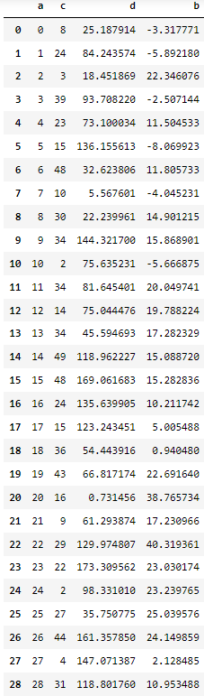
# 1. 딕셔너리를 이용한 DataFrame 생성
# 1. 딕셔너리를 이용한 DataFrame 생성

np.random.seed(100)
data = {'a':np.arange(50),
        'c':np.random.randint(0,50,50),
        'd':np.random.randn(50)
       }
data

===================================================

{'a': array([ 0,  1,  2,  3,  4,  5,  6,  7,  8,  9, 10, 11, 12, 13, 14, 15, 16,
        17, 18, 19, 20, 21, 22, 23, 24, 25, 26, 27, 28, 29, 30, 31, 32, 33,
        34, 35, 36, 37, 38, 39, 40, 41, 42, 43, 44, 45, 46, 47, 48, 49]),
 'c': array([ 8, 24,  3, 39, 23, 15, 48, 10, 30, 34,  2, 34, 14, 34, 49, 48, 24,
        15, 36, 43, 16,  9, 29, 22,  2, 27, 44,  4, 31,  1, 13, 19, 36,  4,
        27,  3,  7, 49, 47,  1, 14,  7, 16,  2, 41, 30, 19, 34, 27, 46]),
 'd': array([-0.25187914, -0.84243574,  0.18451869,  0.9370822 ,  0.73100034,
         1.36155613, -0.32623806,  0.05567601,  0.22239961, -1.443217  ,
        -0.75635231,  0.81645401,  0.75044476, -0.45594693,  1.18962227,
        -1.69061683, -1.35639905, -1.23243451, -0.54443916, -0.66817174,
         0.00731456, -0.61293874,  1.29974807, -1.73309562, -0.9833101 ,
         0.35750775, -1.6135785 ,  1.47071387, -1.1880176 , -0.54974619,
        -0.94004616, -0.82793236,  0.10886347,  0.50780959, -0.86222735,
         1.24946974, -0.07961125, -0.88973148, -0.88179839,  0.01863895,
         0.23784462,  0.01354855, -1.6355294 , -1.04420988,  0.61303888,
         0.73620521,  1.02692144, -1.43219061, -1.8411883 ,  0.36609323])}
data['b'] = data['a'] + 10 * np.random.randn(50)
data['d'] = np.abs(data['d']) * 100
data

=====================================================

{'a': array([ 0,  1,  2,  3,  4,  5,  6,  7,  8,  9, 10, 11, 12, 13, 14, 15, 16,
        17, 18, 19, 20, 21, 22, 23, 24, 25, 26, 27, 28, 29, 30, 31, 32, 33,
        34, 35, 36, 37, 38, 39, 40, 41, 42, 43, 44, 45, 46, 47, 48, 49]),
 'c': array([ 8, 24,  3, 39, 23, 15, 48, 10, 30, 34,  2, 34, 14, 34, 49, 48, 24,
        15, 36, 43, 16,  9, 29, 22,  2, 27, 44,  4, 31,  1, 13, 19, 36,  4,
        27,  3,  7, 49, 47,  1, 14,  7, 16,  2, 41, 30, 19, 34, 27, 46]),
 'd': array([ 25.18791392,  84.24357383,  18.45186906,  93.70822011,
         73.10003438, 136.15561251,  32.62380592,   5.56760149,
         22.23996086, 144.32169952,  75.63523056,  81.6454011 ,
         75.04447615,  45.59469275, 118.9622268 , 169.06168264,
        135.63990489, 123.24345139,  54.44391617,  66.81717368,
          0.73145632,  61.29387355, 129.97480748, 173.30956237,
         98.33100991,  35.75077532, 161.35785028, 147.07138666,
        118.80175973,  54.97461935,  94.00461615,  82.79323644,
         10.88634678,  50.78095905,  86.22273465, 124.94697427,
          7.96112459,  88.97314813,  88.17983895,   1.86389495,
         23.78446219,   1.35485486, 163.55293994, 104.42098777,
         61.30388817,  73.62052133, 102.69214394, 143.21906111,
        184.11883002,  36.60932262]),
 'b': array([-3.31777135, -5.89217978, 22.34607562, -2.50714412, 11.5045333 ,
        -8.06992339, 11.80573336, -4.04523093, 14.9012147 , 15.86890066,
        -5.6668753 , 20.04974121, 19.78822399, 17.28232871, 15.0887199 ,
        15.28283635, 10.21174175,  5.00548801,  0.94047994, 22.69163957,
        38.76573427, 17.2309665 , 40.31936082, 23.03017434, 23.23976534,
        25.03957594, 24.14985889,  2.12848465, 10.95348794, 17.63738993,
         0.26684526, 31.33317278, 29.51111333, 28.49823565, 35.32427801,
        35.22213928, 39.17367976, 29.47585822, 25.03608193, 39.95139444,
        35.762849  , 29.14016435, 38.34538007, 30.28976959, 59.86170938,
        51.93390659, 26.41918766, 45.65198688, 32.59383975, 69.46713968])}
1. DataFrame 시각화
pd.DataFrame(data)
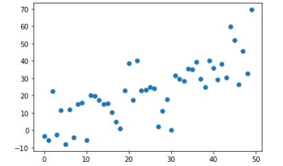
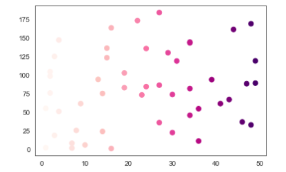
산점도 그래프 그리기 (Scatter)
산점도 그래프는 Scatter() 함수를 사용한다.
X,Y 축에 해당하는 데이터의 상관관계 → 얼마나 많이 분포 혹은 흩어져 있는지를 한 눈에 확인 가능
X,Y 두 개의 축을 기준으로 데이터가 얼마나 퍼져있는 지를 알 수 있다.
# plt.scatter([1,2,3,4],[10,30,20,40], s=[100,200,350,500], c = ['yellow', 'green','orange','red']) # strong, color
plt.scatter([1,2,3,4],[10,30,20,40], s=[100,200,350,500], c=range(4) , cmap='jet')
plt.colorbar()
plt.show()

plt.scatter('a','b', data = data) # 데이터는 어디서왔는지 data = data
plt.show()
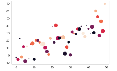
# c = (컬러), s = (사이즈)
plt.scatter('a','b',data=data, c='c', s='d') # s='d' 균등하게 출력
# scatter 자체는 legend 사용할 수 없다.

plt.scatter('c','d',data=data, c='c', s=50,cmap='RdPu') # s='d' 균등하게 출력
plt.show()
# Seaborn style scatter
import seaborn as sns

cutoff = (data['a']>25) & (data ['b'] > 20)
cutoff

sns.set_style('white')
data['color'] = np.where(cutoff==True,"red", "blue")
sns.regplot(x = data['a'],
            y = data['b'],
            scatter_kws={'facecolors':data['color']}
            )
plt.title("Scatter and Plot...", fontsize=16)
plt.show()

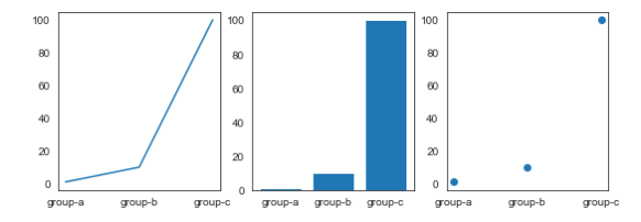
Subplot 으로 plot(), scatter(), bar() 동시에 그려넣기
Subplot은 영역을 쪼개어서 여러개의 그래프를 표현 하고 싶을 때 사용
names = ['group-a','group-b','group-c'] # X 값으로 이용
values = [1,10,100] # Y 값으로 이용
plt.figure(figsize=(9,3)) # 전체 영역을 새롭게 잡아 놓는다. 3등분 하기 쉽도록
plt.subplot(131)
plt.plot(names,values)

plt.subplot(132)
plt.bar(names,values)

plt.subplot(133)
plt.scatter(names,values)

plt.show()
히스토그램
hist() 함수 사용
데이터의 분포 상태를 나타내는 그래프로서 데이터의 빈도에 따라서 막대의 높이가 결정된다.
plot() 사용해서 꺽은선 그래프를 그렸고
scatter() 사용해서 산포도를 그렸듯이
hist() 사용해서 막대그래프를 그릴텐데 막대의 높이가 빈도수와 직결된다.
import matplotlib.pyplot as plt
import numpy as np
plt.hist([1,1,2,3,4,5,6,6,7,8,10]) # X 데이터
plt.show()

# bins 옵션
히스토그램에서는 bins값을 적당히 설정하는 것이 중요
bins 값이 너무 크면 막대가 너무 촘촘해서 이상하고
bins 값이 너무 작으면 막대가 너무 굵어서 문제가 있다
bins 값을 입력하지 않으면 기본값으로 잡히기 때문에 특별한 경우가 아니라면 생략한다.
bins?
해당 막대의 영역을 얼마나 채울지를 결정하는 변수
bins가 6인경우 6+1범위로 나눈 값으로 너비를 입력한다.
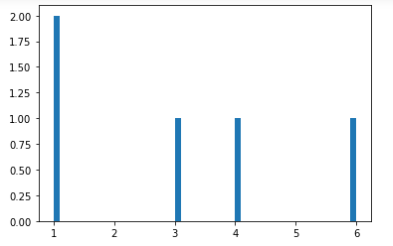
dice = []
for i in range(5):
    dice.append(np.random.randint(1,7))
print(dice)

================================

[4, 3, 1, 6, 1]
plt.hist(dice, bins = 50)
plt.show()
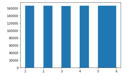
# 주사위를 100만번 돌렸을 때 각 1~6까지의 숫자가 나오는 빈도수를 구함
'''
큰수의 법칙
던지는 횟수를 늘릴수록 특정한 숫자가 나오는 횟수가 전체 1/6에 가까워 진다는
수학적인 학설이 입증됨
'''


for i in range(1000000):
    dice.append(np.random.randint(1,7))

plt.hist(dice)
plt.show()
mu, sigma = 100, 15

x = mu + sigma * np.random.randn(10000)
x # 1만개의 값이 들어있다.
x.shape

======================

(10000,)
plt.hist(x)

'''
n : 빈도수
bins : 구간
patches : 그래프 정보 자체
'''
n, bins, patches = plt.hist(x)
print(n)
print(bins)
print(patches)
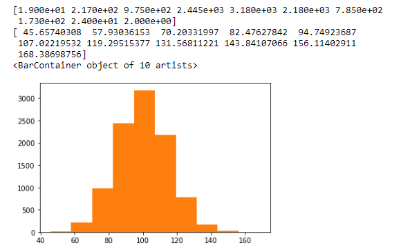
# 값을 세밀하게 보고싶다면 bins 로 조절
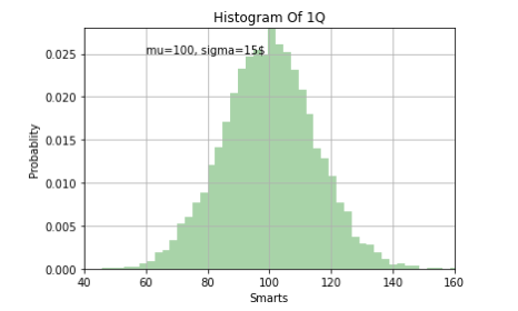
n,bins,patches = plt.hist(x,bins=50,
facecolor='g',
density=1, #1을 기준으로 했을때의 상대적 빈도값
alpha=0.34) # 투명도 조절 0~1
plt.xlabel('Smarts')
plt.ylabel('Probablity')
plt.title('Histogram Of 1Q')
plt.grid()
plt.text(60, 0.025, r'mu=100, sigma=15$') # r은 raw : 해석하지말고 문자 그대로 받아들여라
# plt.text(60, 0.025, 'mu=100, \sigma=15$')
# plt.text(60, 0.025, r'μ=100, σ=15')
# # 필요없는 부분은 자른다
plt.axis([40, 160, 0, 0.028])
plt.show()
Seaborn을 이용한 시각화
BoxPlot
import matplotlib.pyplot as plt
import numpy as np
import pandas as pd
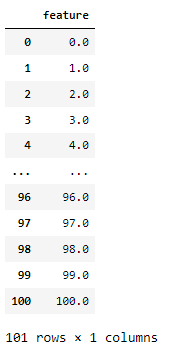
import seaborn as sns# 0 부터 100까지 총 101 개의 숫자를 만든다
xs = np.array(np.linspace(start=0, stop=100, num=101))
xs
df = pd.DataFrame(xs, columns = ['feature'])
df
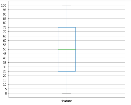
# 위에서 만든 df를 가지고 boxplot을 그려보자
'''
출력 그래프를 보면, 초록색선 중앙값
25.75% 사이에 박스가 하나 그려지고 (이부분이 50%)
정 중앙값(중간값) 50부분이 녹색선
최소값 0 최대값 100 이 부분에 검은색 가로선이 그려진다
'''
plt.figure(figsize=(7,6))
df.boxplot(column=['feature'])
plt.yticks(np.arange(0,101,step=5))
plt.show()
# tips 데이터로 바로 활용
# tips데이터로 바로 활용
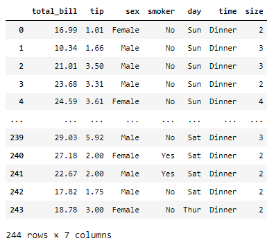
tips = sns.load_dataset('tips') # sns 라이브러리 안에 있는 파일
tips
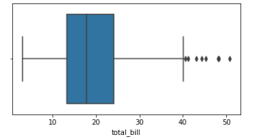
total_bill 값을 가지고 tip data의 중앙값과 50% 안에 들어가는 tip 값을 살펴보자
# total_bill 값을 가지고 tip data의 중앙값과 50% 안에 들어가는 tip 값을 살펴보자

plt.figure(figsize=(6,3))
sns.boxplot(x=tips['total_bill'])
plt.show()
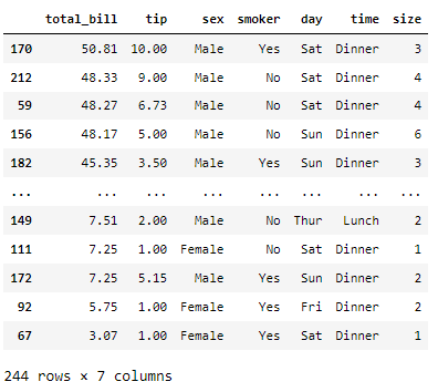
tips.sort_values(by='total_bill', ascending=False)
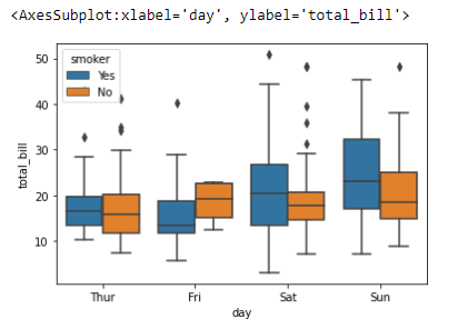
날짜별로 데이터를 분석
# 날짜별로 데이터를 분석
sns.boxplot(x='day', y='total_bill', data=tips)

sns.boxplot(x='day', y='total_bill', data=tips, hue='smoker')
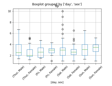
tips.boxplot(column=['tip'], by=['day','sex'])
plt.xticks(rotation=45)
plt.show()
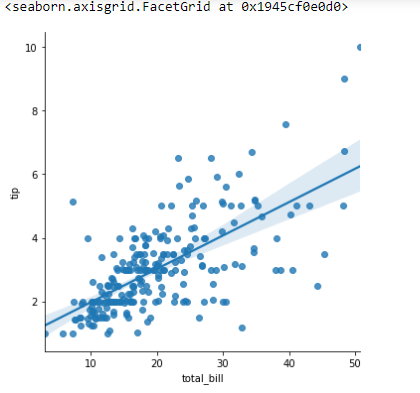
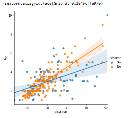
Lmplot
sns.lmplot(x='total_bill', y='tip',data=tips)
sns.lmplot(x='total_bill', y='tip', hue = 'smoker', data=tips)
Heatmap
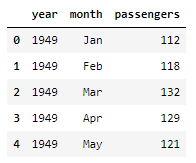
flights = sns.load_dataset('flights')
flights.head()
# 피벗테이블

flights = flights.pivot(index='month', values='passengers', columns = 'year')
flights
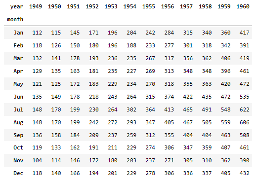
'''
x축은 Year
y축은 month
년도가 올라갈수록
여름철(휴가철) 승객이 몰리는 현상으로 분석
'''

plt.figure(figsize=(10,8))
# sns.heatmap(flights)
sns.heatmap(flights, annot=True, fmt="d")
plt.show()

참고 사이트
seaborn : https://seaborn.pydata.org
'|Playdata_study > Python' 카테고리의 다른 글
| 210914_powershell 실행오류 (0) | 2021.09.16 |
|---|---|
| 210726_Pivot Tables 2 (0) | 2021.07.26 |
| 210723_GroupBy, Pivot Tables (0) | 2021.07.24 |
| 210723_Concat,Merge (0) | 2021.07.24 |
| 210722_NaN (누락데이터) (0) | 2021.07.23 |


댓글